Burnup and Burndown charts in Smartsheet
2 min readNOTE: THIS IS NOT CURRENTLY AVAILBLE TO BE SHARED, I’LL LET YOU KNOW WHEN IT’S BACK!
Here at Anthrotechnic, we’re fans of Smartsheet and have used it internally for some time to manage our sales and work processes.
However, one thing that it would be handy to have is a way to generate Burnup and Burndown charts.
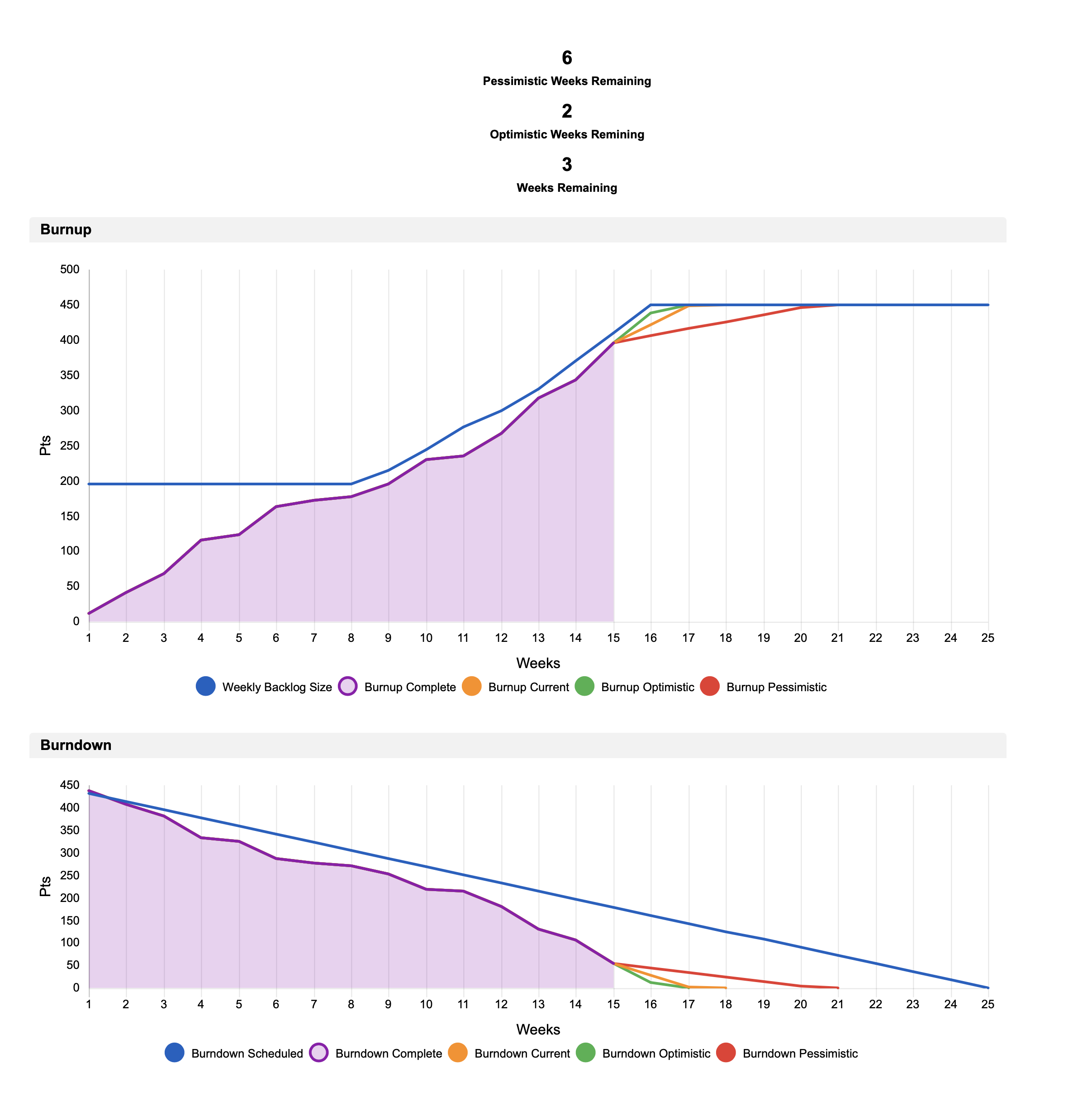
So as a bit of an experiment, I decided to build a simple tool that would generate a Burnup and Burndown chart from simple velocity metrics.
One thing I wanted was some very crude modelling that might help predict how much time might be remaining based on the work left to complete. The calculation is nothing special; I’m not trying to do Monte Carlo simulations - but it is helpful when discussing what might be done in X weeks time or indicating how things are going.
Of course, I’m obligated to note that velocity, in particular, is much abused and shouldn’t become a target or a measure in itself. It’s there to act as an input so we can make predictions based on ‘yesterday’s weather.
Anyway - after some tinkering here’s what I ended up with:


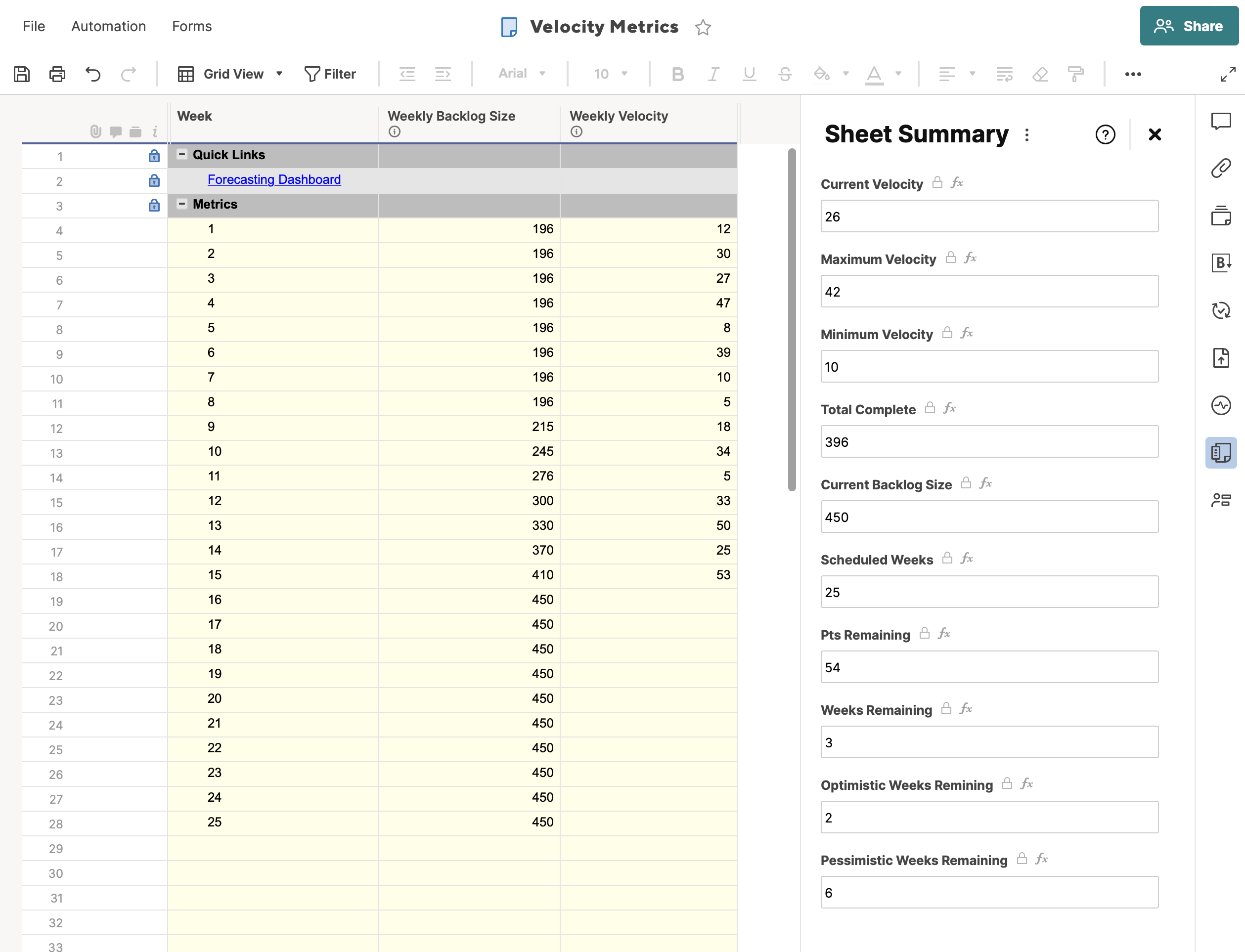
I’ve gone for a weekly input schedule for this, but it could be any length (assuming it’s consistent). Then each week, you update the sheet, say which week you’re on, how big the backlog is (have you added or cut scope) and how many items or pts you delivered.
I prefer to count the items delivered, but you may want to estimate and use story pts if you like.
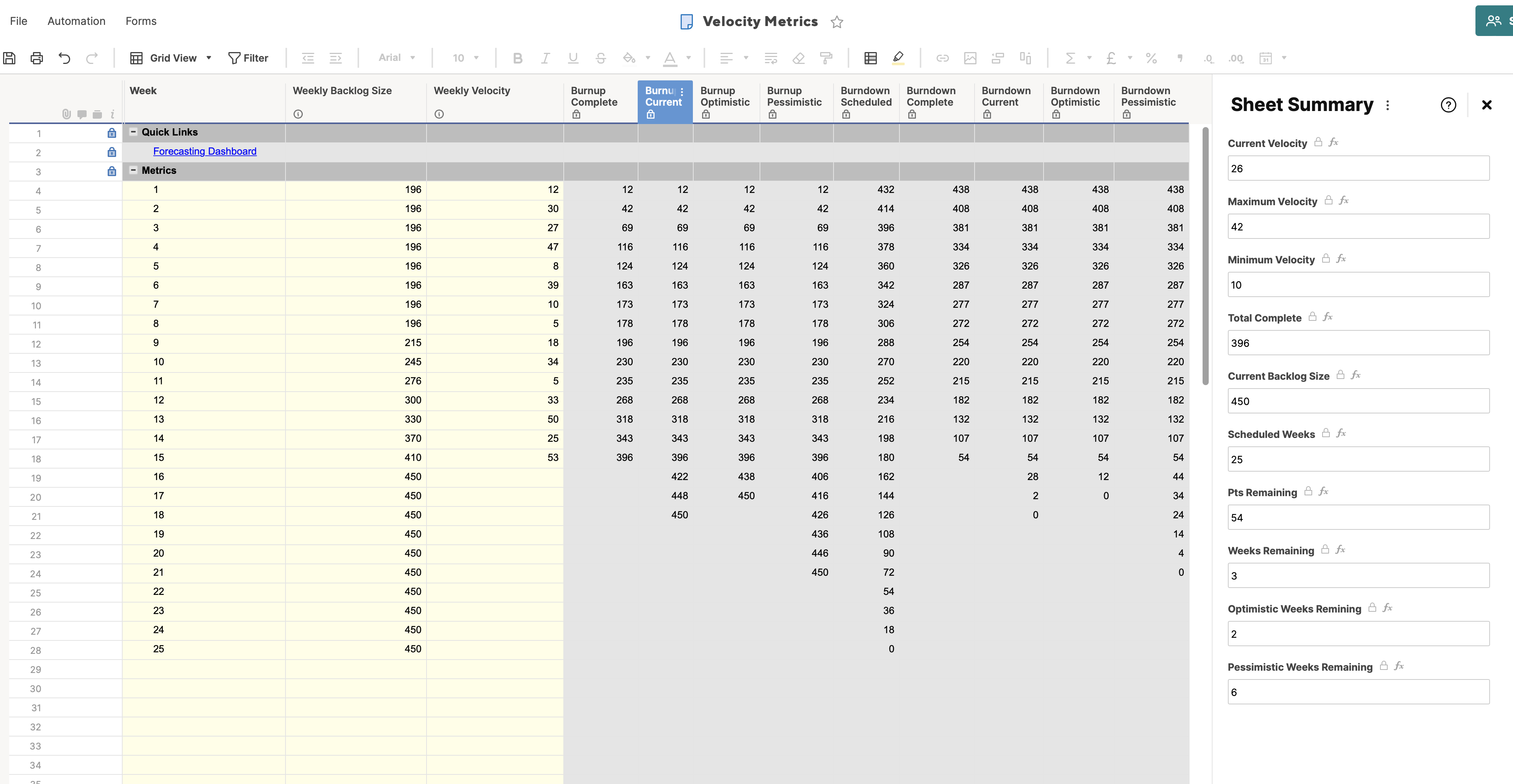
The sheet then calculates a bunch of metrics (which you can see in the summary). There are also some hidden fields on the sheet used to generate the charts on the dashboard.

The basis for the predictions is to take the Average number of items/pts delivered per week and then add one std deviation each way - giving us a range of velocities to draw the charts. It’s crude but can be helpful!
Unfortunately, I am not able to share this sheet at the moment. If you are interested in when it will be availble again please feel free to contact me using the form below.

